Weinberg Wedding
A custom event experience designed around a warm, cohesive visual system.
This project shows how I take one creative idea and carry it all the way through—from print to environment to guest touch-points. The experience felt thoughtful, human, and not overdesigned.
Background Context
This project involved designing a cohesive visual identity for a custom, multi-touchpoint event. The focus was on creating a visual system that felt intentional and cohesive across print, space, and on-site details—supporting the overall experience without feeling themed or ornamental.
This work was created for my own wedding to my husband, Gabe. We’re both design majors and longtime lovers of food, drink, and hosting, so designing the wedding ourselves felt both personal and natural. Custom illustrations and art direction played a central role in shaping an experience that felt thoughtful, cohesive, and true to us.
Core Objective
Design a unified visual language that could scale across print, environmental elements, and on-site details—creating a cohesive guest experience grounded in hospitality rather than decoration.
Success meant consistency without monotony: every element needed to feel connected, while still serving a clear functional role throughout the event.
My Approach
I approached this as an art direction challenge rather than a collection of individual design tasks. The priority was establishing a strong foundational concept that could flex across formats, surfaces, and moments across the event lifecycle.
My approach focused on:
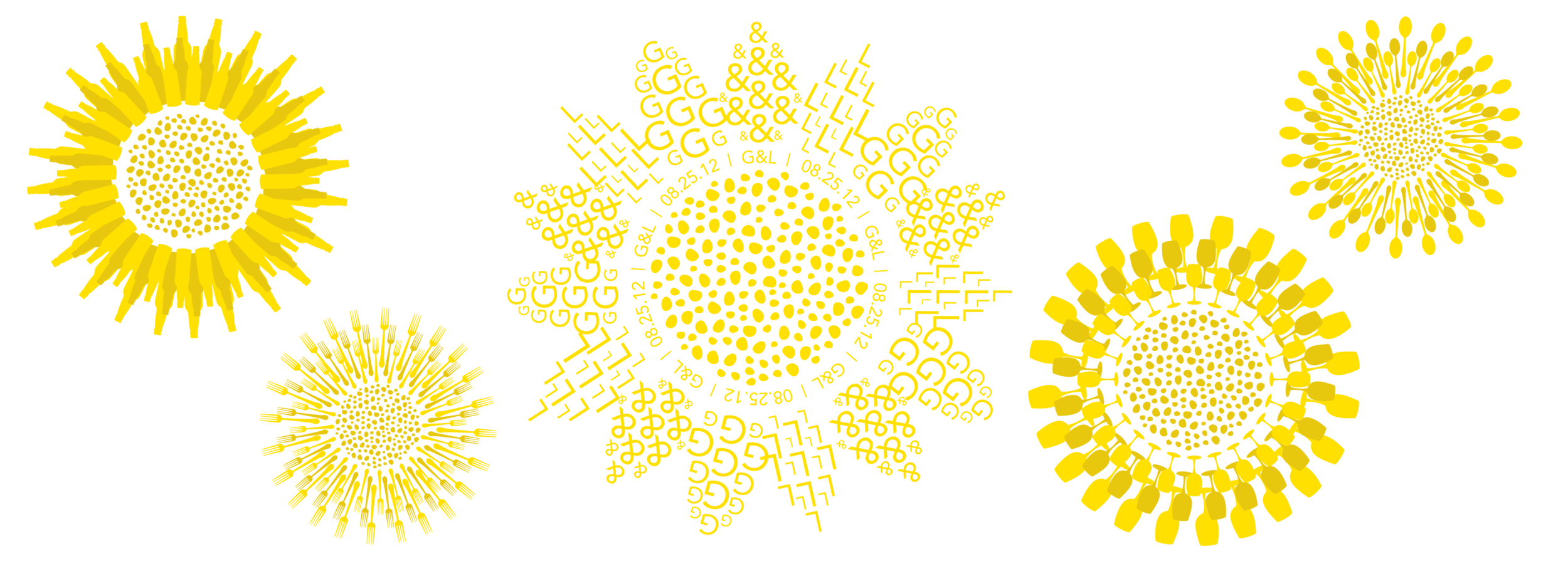
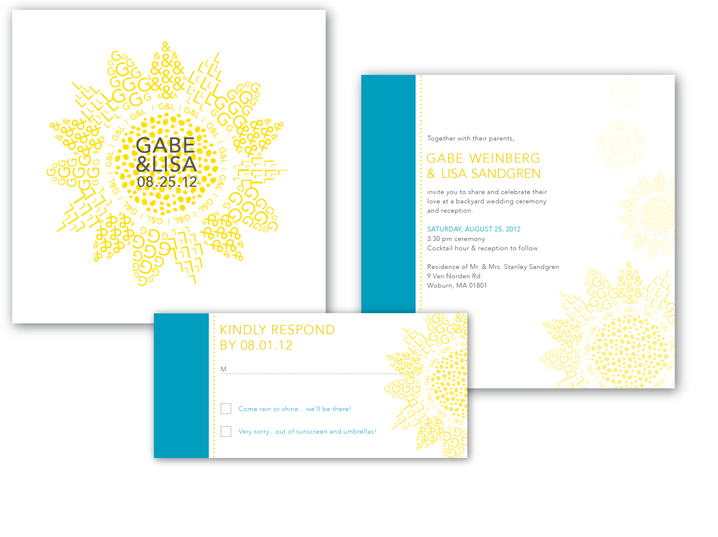
Defining a clear visual language—color, typography, and illustration style—that could scale across print and physical space
Designing custom illustrations that functioned as both expressive and structural elements
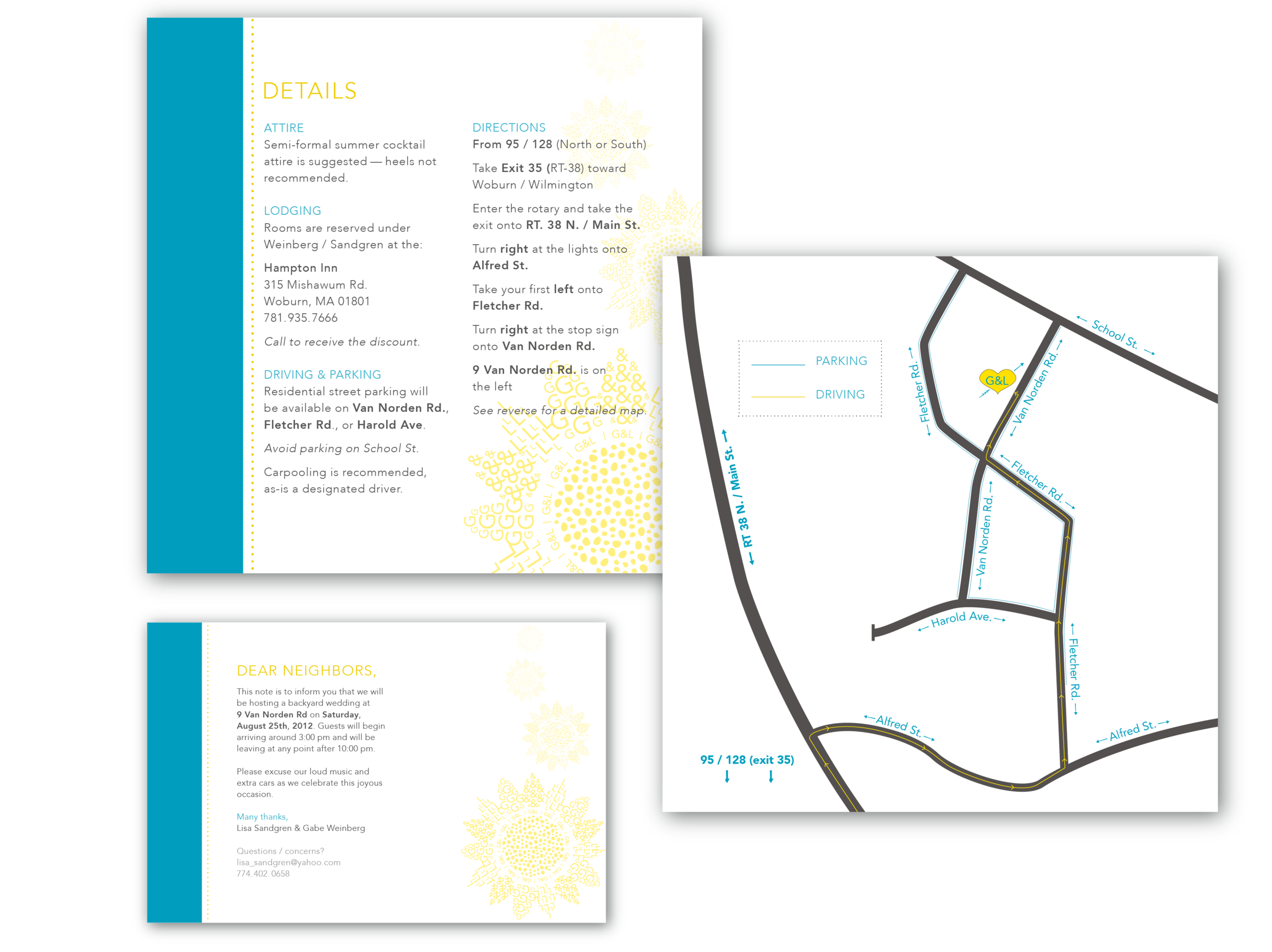
Treating invitations, paper goods, signage, and environmental details as one cohesive system
Using repetition intentionally, ensuring variation without visual fatigue
Each asset was designed in conversation with the others, with attention to how guests would experience the event as a whole.
Design System
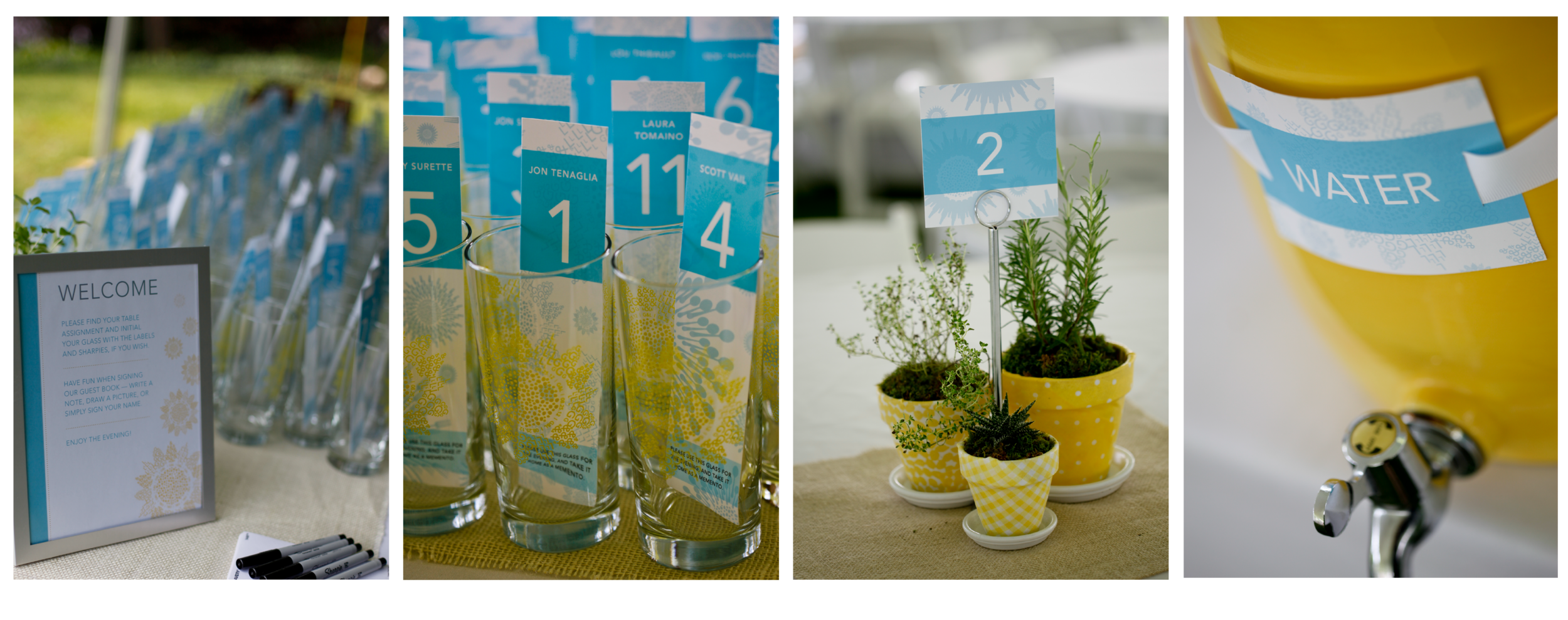
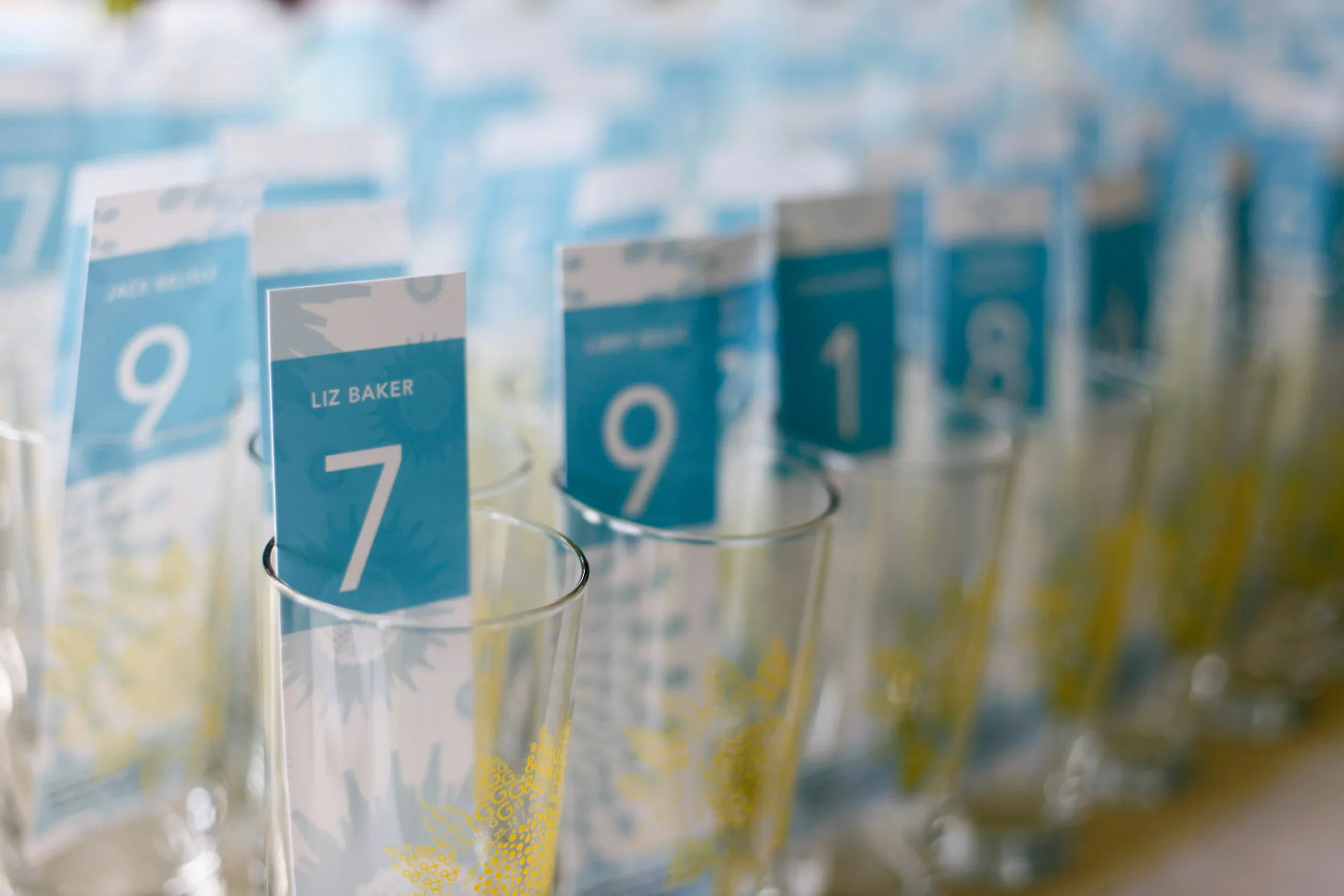
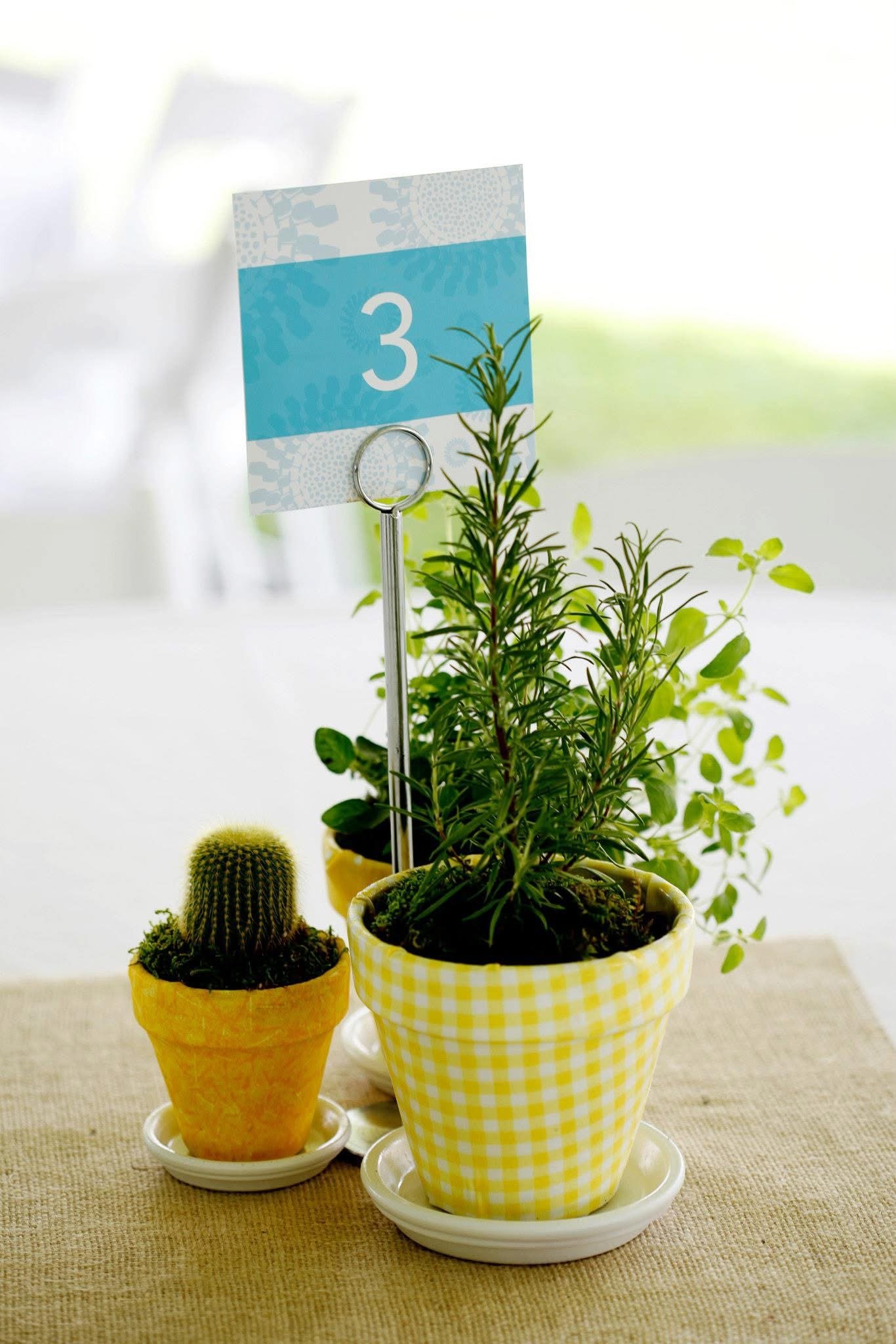
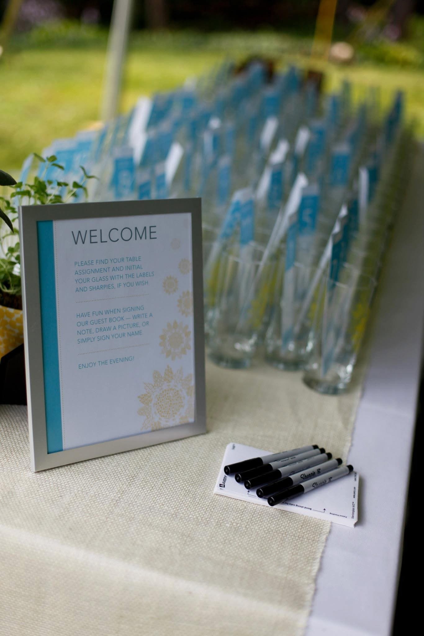
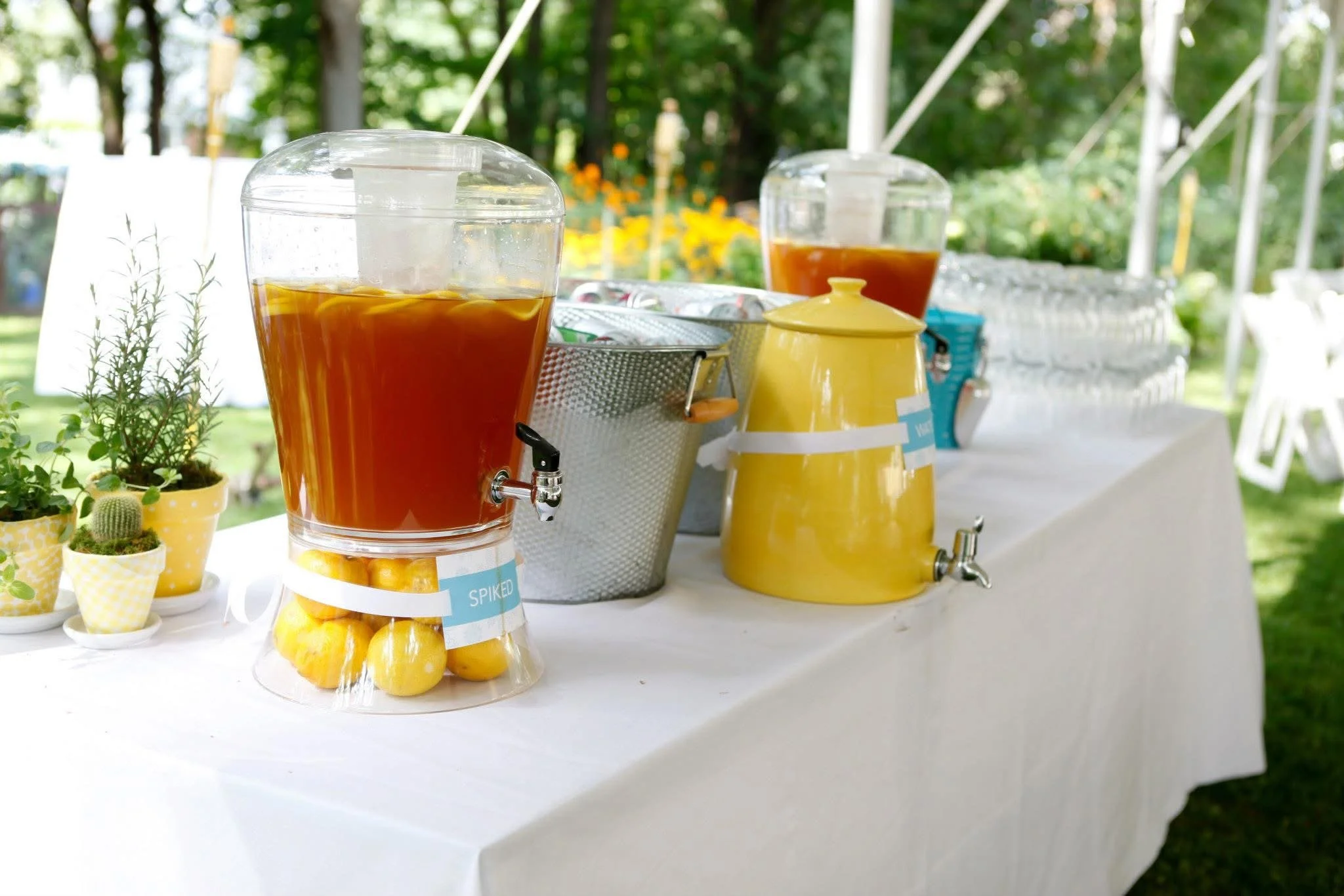
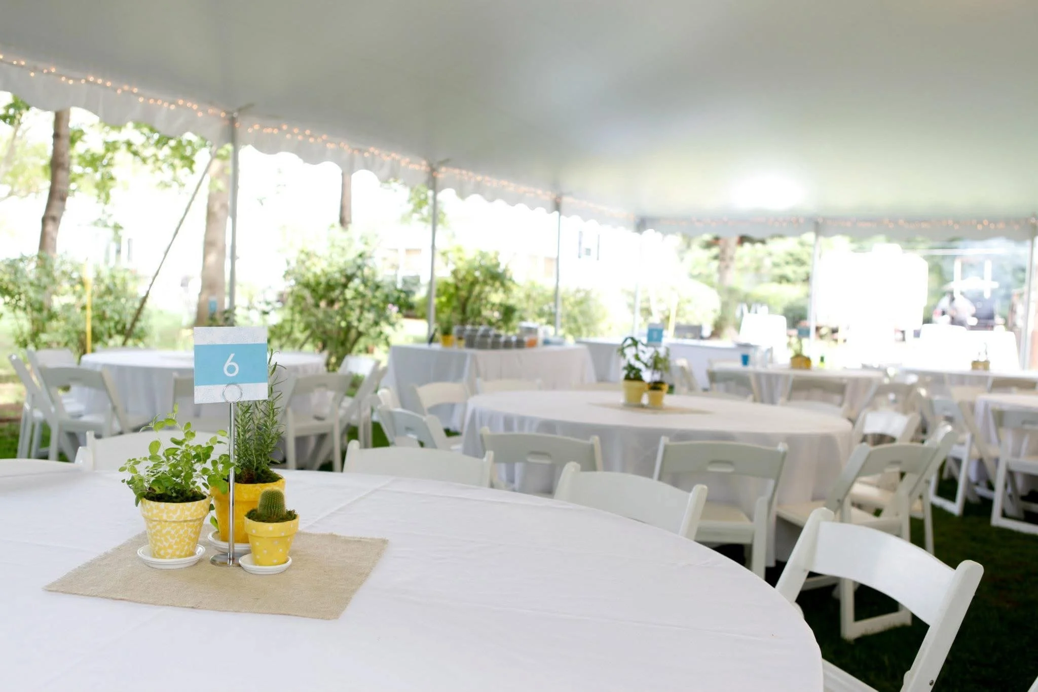
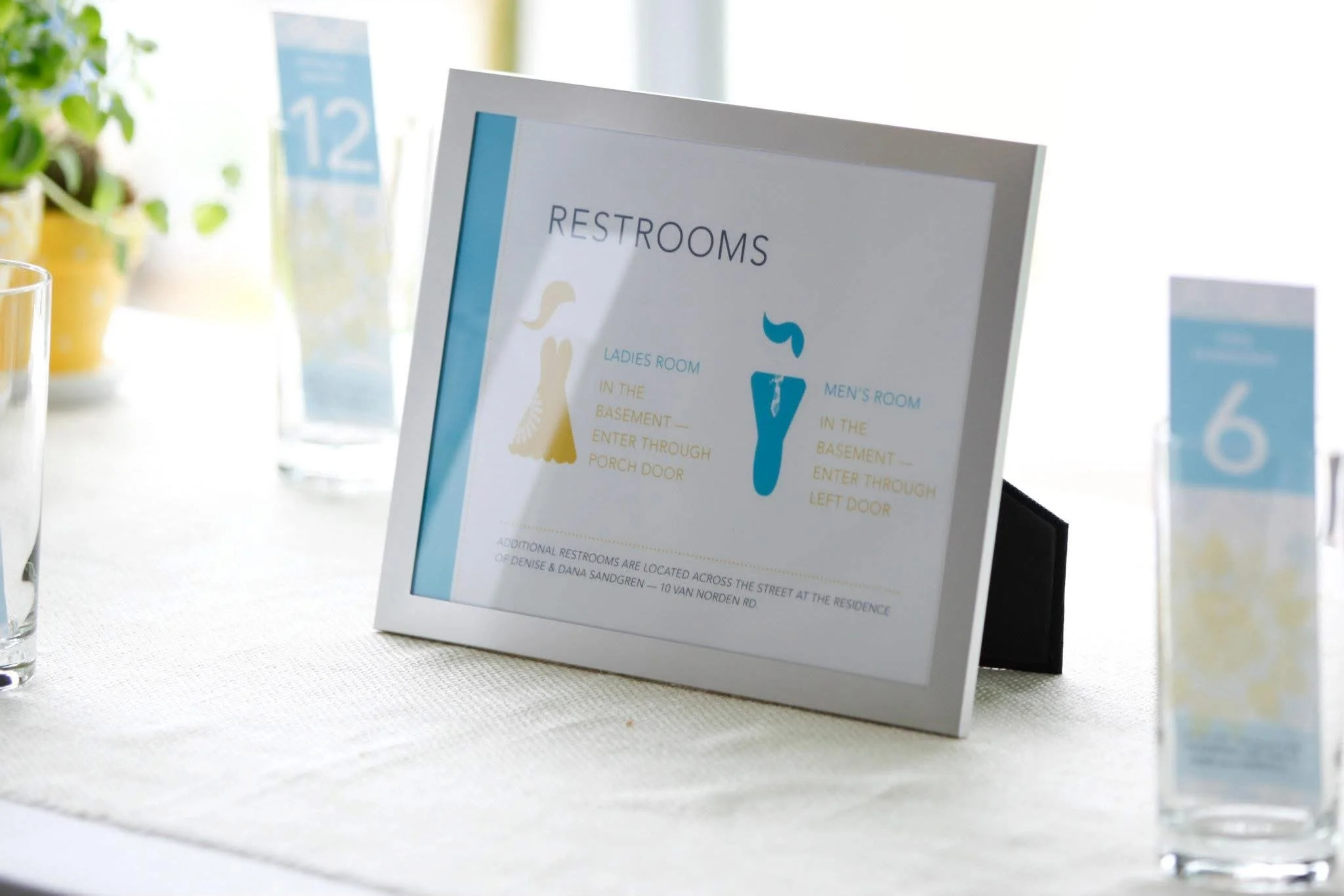
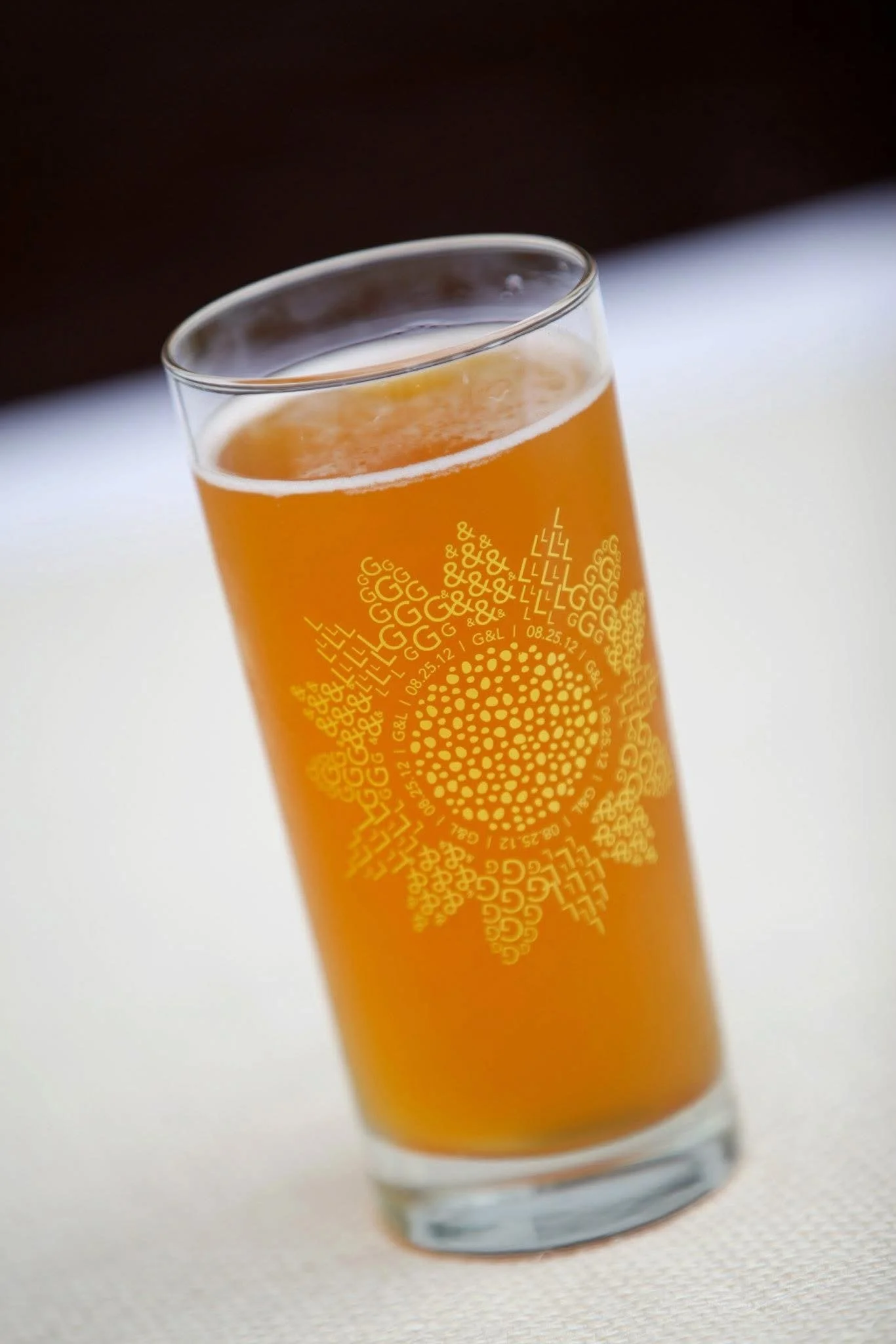
The visual system was applied consistently across invitations, day-of paper goods, environmental signage, wayfinding, and on-site details such as table numbers, labels, and displays.
Rather than standing alone, each touchpoint reinforced the same visual story—allowing guests to move through the event with a sense of familiarity, clarity, and cohesion.
Key Reflections
The result was a visually cohesive, immersive event experience that felt warm, intentional, and effortless for guests—from the backyard garden setting and food experience to the color story and on-site details. Feedback consistently reinforced that sense of cohesion, with guests noting how thoughtfully curated and enjoyable the overall environment felt.
More importantly, this project reinforced a core belief that guides my design work: strong design systems don’t call attention to themselves. When done well, they quietly shape experience, create cohesion, and allow people to focus on what matters most.